Last week, I visited my former place of work, The Open University in Milton Keynes (hereinafter ‘the OU’) for a couple of meetings. And it reminded me that I had intended to write down a few reflective thoughts about this rather odd but special place, which I left at the end of December 2009.
Now, the first thing to say is that my thoughts come from my own distinct experience. Not only that, they are also going to be pretty superficial when compared with the experiences of anyone who has worked at the OU for several years, whether as one of its army of professional and administrative staff, or as one those academics who’ve partaken in the high-level ‘teaching’ activities, such as putting together (quite excellent) course texts, or helping produce (and even appear in) DVD and Audio CD programmes (the days of OU lectures on television – brilliantly satirised by Stephen Fry – having passed long ago). Compared with my meagre two-and-a-half years, mostly in research fellow type roles, with only a brief experience on a great course in its final years (DD304 Understanding Cities) … well, you probably get the idea.
But nevertheless…
Okay, so how do I begin? Well, in my dying days of being around the OU in Milton Keynes, I indulged in a couple of walks around the campus, and with phone in hand, took some photos. As I look at these now, it occurs to me that they work pretty well as pragmatic take-off points which – with a bit of added inference-making – let me point to a few features of the OU, at least as they occurred to me.
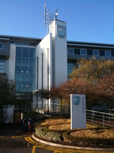
Berrill Reception, The Open University
If it is your very first visit to the OU, or even if you’ve been before but still make your visit as an ‘outsider’, you are likely to arrive at the main Berrill reception. Partly, needing to come to this location has to do with the security lock-down that pervades the rest of the campus (more on this later). But as one arrives at this building, and their journey around the campus proceeds, what is particularly striking is the pervasiveness of the OU logo.
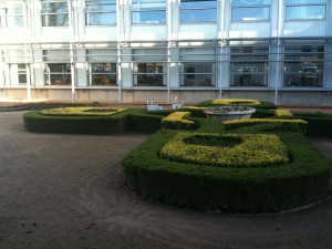
The OU logo in hedges
It’s placed on signs, as you’d expect. It’s built into buildings. It’s etched on glass. Hedges and gardens are rendered into its shape. Even the pieces of art around the campus seem to somehow correspond to a more general aesthetic, if not the logo itself. I am without doubt reading into this excessively. But, the OU as an organization exists alongside a very pervasive and unique sort of semiotic system. From the buildings, signage, and other features at its Milton Keynes campus extends a much wider circulatory existence of the university, not just through its regional offices, but its various publications, publicity materials and websites.
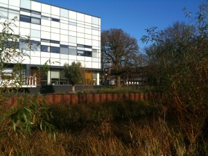
Jenny Lee Building, with new wave environmentally-conscious landscaping
I always thought, for instance, that the colours and shades on the glass cladding of the new Jenny Lee Building had an unmistakable resonance (a Bourdieu-like homology?) with the OU website. I should add that this hyperreal image I’ve outlined actually comes less from dallying about the campus, and more so from my exposure the OU’s rigorously-adhered to ‘brand guidance’. This defines things like the placements of logos, the approved pantone colour schemes, even the preferred types of photos, to be used in publicity material. If you hold an event, say, there are templates you
must use for the flyer. In other words, this is a university with a very strong organizational projection of itself. You can probably tell that I was at times frustrated by this; indeed, at its worst, I thought it was just sheer madness. But in the end, from an organizational point of view, it was and is probably both effective and affective.
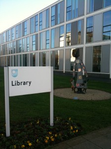
The new OU Library
Most of the campus is relatively new. Many of the buildings are of a distinct 1970s and 1980s vintage, but there are several more recent buildings, some quite well-designed in my opinion. The new library is particularly excellent. It doesn’t have every book imaginable, naturally, but it houses the resources it does have in a well-designed, indeed quite serene environment. Oh, and it has very helpful staff. After all, and frankly, compared to other university libraries, they see far fewer actual visitors!
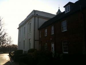
Walton Hall
At the centre of the campus is the oldest building, Walton Hall, a manor house which now serves as the offices of the Vice Chancellor, amongst other things. Nearby and within the campus is a tiny, deconsecrated parish church, for the parish of Walton. I always wanted to attend some sort of event there – we briefly considered it as the venue for the
Mediapolis workshop if I recall correctly – but it was not to be.
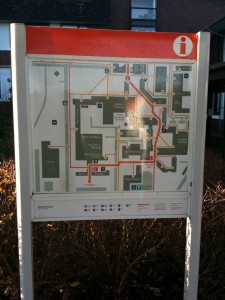
OU Central Walkway map
Now, like Milton Keynes, the city in which it is located, the overall design of the campus seems to have been imagined around the automobile (I comment a little more on this below). How the average pedestrian navigates this environment is another matter entirely. There was one answer, however: the ‘Central Walkway’. Despite its name, which sounds like it refers to some sort of central modernist spine a la Brasilia, this is actually a post-hoc attempt to bring forth some sort of peripatetic order, a walkway that twists and turns its way through the campus.
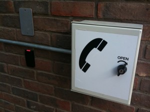
Do remember you access card...
The Central Walkway is one reason why most visitors really need to be met at Berrill reception by a weathered OU resident. The other, of course, is that all the buildings are in a virtual security lockdown, accessed by proximity cards. I did my PhD at King’s College London, which is right at the border of the City of London and City of Westminster, along the River Thames, yet it was a far less securitized environment than the OU in its countrified setting on the edge of Milton Keynes. But maybe that’s the point: it is a rather lonely place to be working alone at night. Anyway, the impressive bit of this whole security apparatus is the security lodge near the entrance. If you pass this building at night, you will bear witness to an intense glow, coming from a most impressive panopticon made of CCTV screens. I wish I had a photo of it.
Continued in part two…


[…] This is the second of the two-part post. See the first post. […]